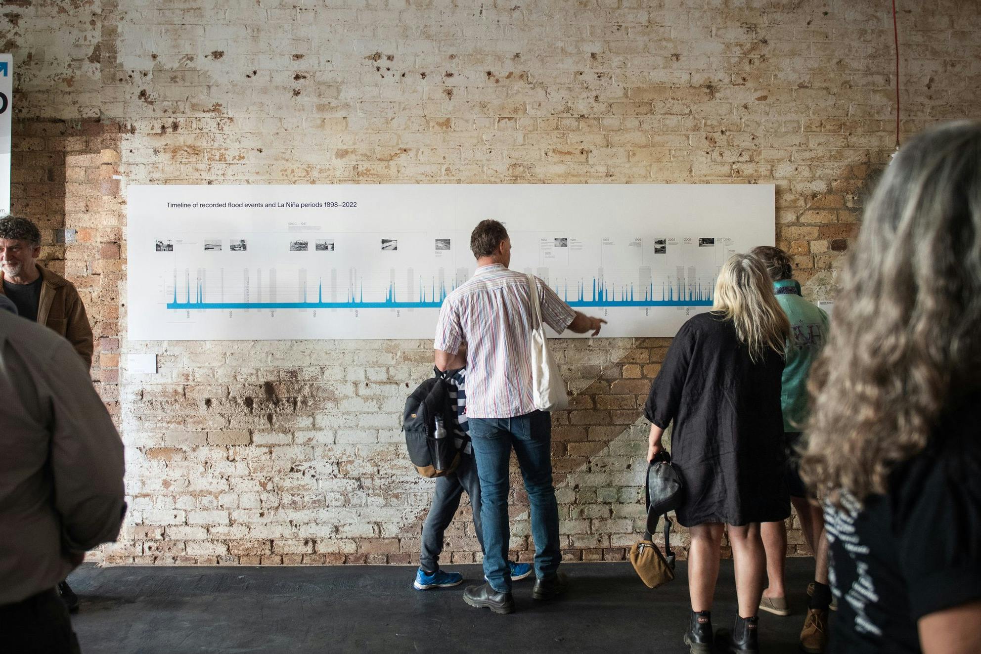
The Municipal Association of Victoria (MAV)
When Victoria’s 79 local councils need support and sector leadership, they turn to the good folks at the Municipal Association of Victoria. They’re the local government peak body that provides advocacy, resources and guidance. Which, without being too dramatic, kind of puts them at the foundation of democracy itself.
Projects delivered:
When every leader knows their story, the organisation has a stronger voice.
“Working with the Fireside team was an extremely positive and collaborative process. Lou and Lara masterfully translated our story into a rich and dynamic brand architecture. Great work, team!”
– Bonnie Shaw, Chief Innovator in Residence, MAV
The challenge
MAV had developed an ambitious vision for MAVlab: an innovation hub that would help Victoria's councils experiment with fresh approaches to complex local challenges. But they faced a crucial branding dilemma. How do you create an identity that signals bold innovation and experimentation while maintaining connection to a 156-year-old institution that councils trust implicitly?
The new initiative needed to feel cutting-edge enough to attract forward-thinking council staff, yet credible enough to sit alongside MAV's established authority in the sector. MAV's internal team had the concept nailed down, but translating that vision into a cohesive brand identity that worked across government websites, social media, conference presentations, and everything in between required specialist expertise they didn't have in-house.
How we solved it
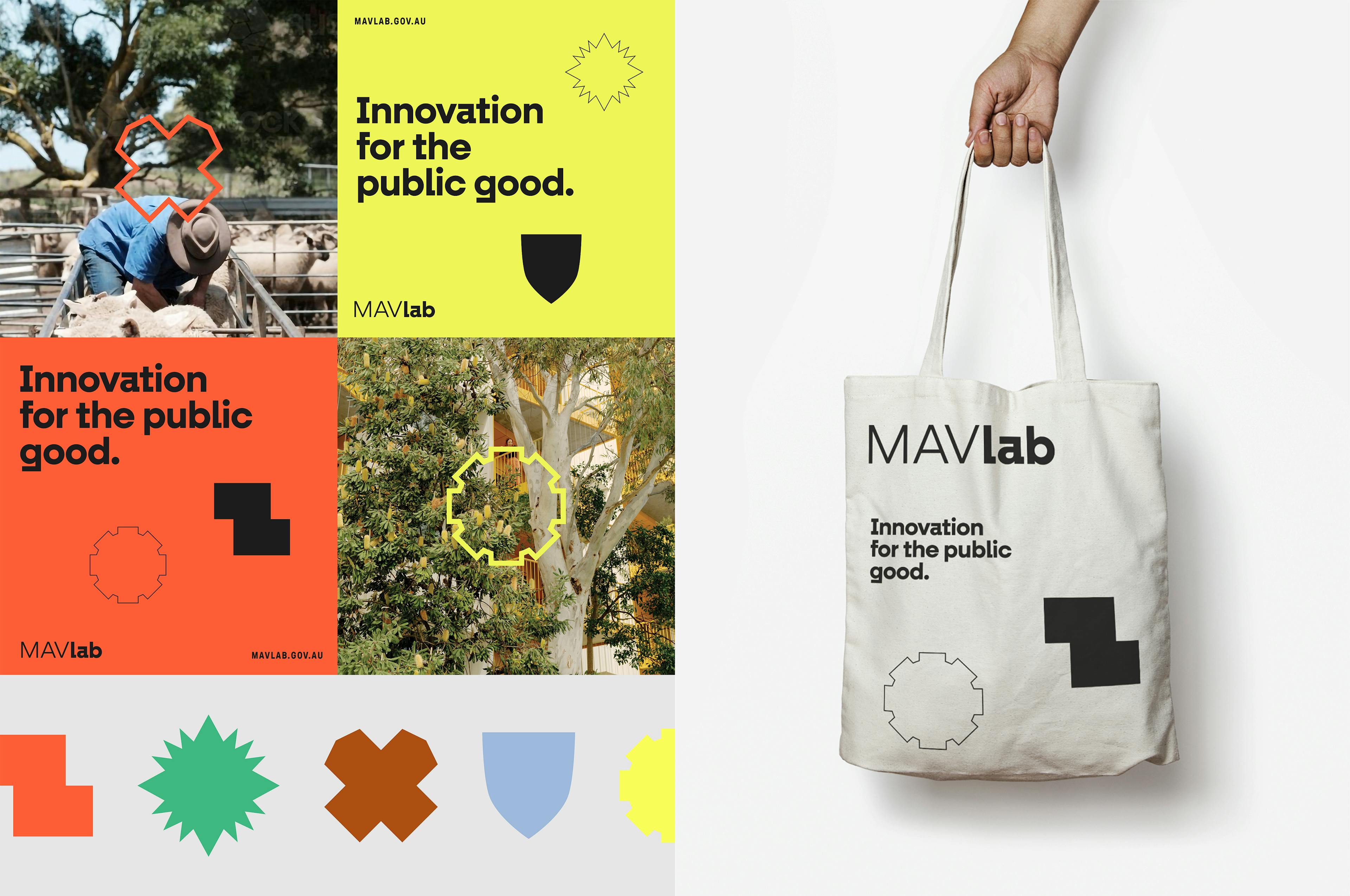
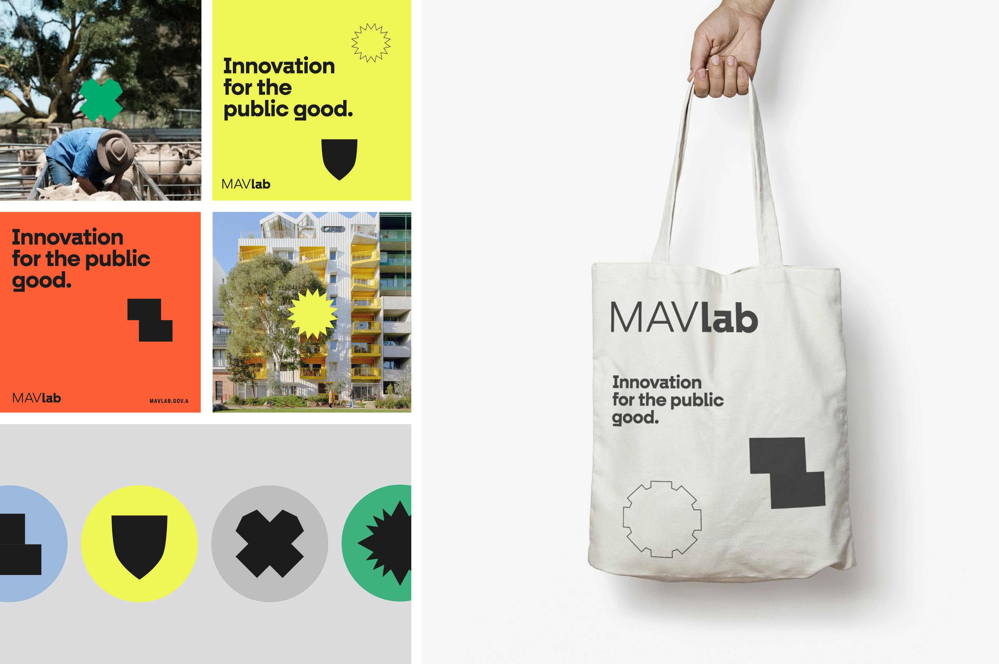
We embedded ourselves in MAV's team to understand their vision and the tricky positioning challenge they faced. Rather than creating something entirely new, we found a clever solution that honoured MAV's 156-year history while signalling bold innovation.
We took six elements from MAV's original 1968 coat-of-arms – things like a shield, compass and cog – and reimagined them as clean, modern icons. Each one tells part of the story: the shield represents integrity, the compass represents guidance, the cog represents problem-solving. We connected each icon back to its heritage with thin lines, so people could instantly see the connection between MAV's past and MAVlab's future.
This approach, combined with fresh colours and the motto "innovation for the public good," created a complete brand that works everywhere from government websites to conference presentations. The result positioned MAVlab as genuinely innovative while maintaining the trust and credibility councils expect from MAV.
What we learned:

What we learned:
- Heritage and innovation aren't enemies. The strongest brands usually come from reimagining what already exists, not burning it down and starting over.
- Sometimes the trickiest positioning problems are best solved visually – literally drawing the line between where you've been and where you're going.